小程序交流群:609690978
1.template
关于template模板的话,我就长话短说。简单点讲,如果你有多个页面使用的UI布局都是一样的,又没有什么逻辑,比如首页有一个热销商品,商品列表又有个一样的布局,如下图:
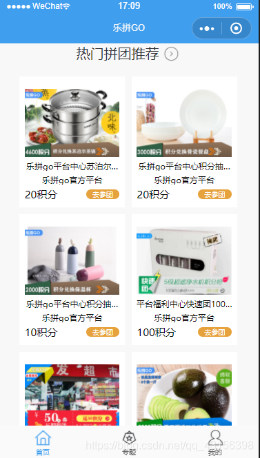
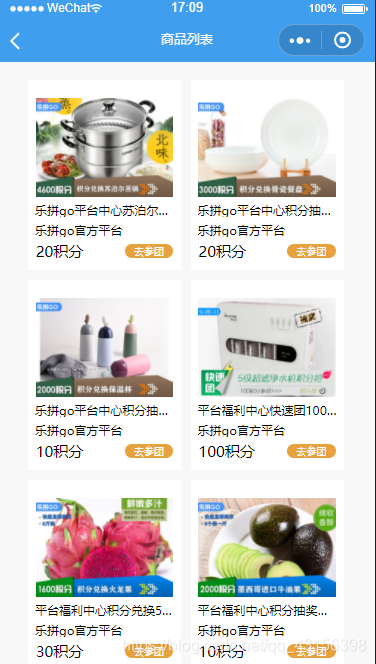
像这样的,你点击一下就会进入到商品详情页,没有其他任何逻辑,单纯的为了展示,你就可以使用template。
1.新建一个template文件夹,在里面建子文件夹goodList,然后,你只需要写wxml和wxss即可,wxss略,我只展示wxml代码
<template name = 'goodList'>
<view class='pubile-title hot-box'>
<view class='hot-item-box'>
<navigator url="/pages/join/join?id={{item.id}}&type=self" class='hot-item' wx:if="{{hotRecommend != ''}}" wx:for="{{hotRecommend}}" wx:key="{{hotRecommend.id}}">
<image src='{{item.primary_pic_url}}'></image>
<text>{{item.name}}</text>
<text>{{item.store_name}}</text>
<view class='price-box'>
<text wx:if="{{item.goods_type == 0}}">{{item.retail_price}}积分</text>
<text wx:else>¥{{item.retail_price}}</text>
<view class='team'>去参团</view>
</view>
</navigator>
</view>
</view>
</template>
import '../../template/goodList/goodList.wxml'
<template is="goodList" data="{{goodList}}"></template>
这样一来,一个模板的创建和引用就ok了。
2.Component,自定义组件
首先,我想说,大家或多或少的可能看到别人的代码上有一些不属于html5里的标签(不管是vue还是微信小程序)。但是却能展示相应的页面内容,这是怎么做到的?――Component,自定义组件!
什么是自定义组件呢?说通俗点吧,如果你用过VUE,肯定知道组件化开发。没错,小程序也有组件化开发的概念。第三方ui组件库vant(有赞)就有小程序的组件,这些都是通过Conponent完成的。
比如cell布局,tabbar,tab标签栏,nav导航栏等等,这些很多地方都能用得到的,就叫组件。那组件化有什么好处呢?当时也是为了简化开发,打个简单的比方,例如导航栏,也就是页面头部。你总不可能我有100个页面就写100个头吧,额……你可以复制粘贴,但是,这不是我们要的效果,可能我导航A上面有张图,导航B上面没有,这样的话你就得改!!!即使都一样,你每个复制粘贴,麻烦不麻烦,代码多不多。看着就很low对吧。怎么让我们的代码变得有逼格一点呢?使用Component自定义组件吧,你可能看过其相关的文档:https://developers.weixin.qq.com/miniprogram/dev/reference/api/Component.html,很无语对吧,腾讯的文档似乎就是为了不让开发者看懂。各种含糊,不管它,下面我将引导大家如何去使用。
first,可能有人要问我了,看了我的描述感觉componet和template一样都是公用的,却要分开讲,有什么区别?这也是我要告诉大家的,我在上文讲template的时候,反复强调了一句话“如果你有多个页面使用的UI布局都是一样的,又没有什么逻辑,你就可以使用template。”而两者的区别在于:component功能更加强大,可以包含几乎任何逻辑操作,也就是说,你要给其某个元素添加点击事件,或者取input的值,都是可以的。而template则不行
好了,唠叨了这么多,正式开始。(CSS略)
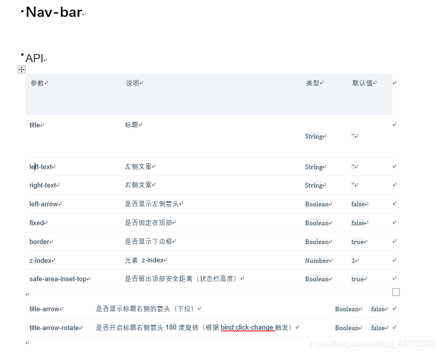
1.新建一个components文件夹。用来存放你的自定义组件,我这里写一个自定义的头部导航组件。功能如下:
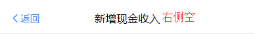
效果一:
效果2:
2.wxml
<view
class="custom-class chenqian-nav-bar {{ border ? 'chenqian-hairline--bottom' : '' }} {{ fixed ? 'chenqian-nav-bar--fixed' : '' }}"
style="z-index: {{ zIndex }}"
>
<view class="chenqian-nav-bar__left" bind:tap="onClickLeft">
<block wx:if="{{ leftArrow || leftText }}">
<van-icon
wx:if="{{ leftArrow }}"
size="16px"
name="arrow-left"
custom-class="chenqian-nav-bar__arrow"
/>
<view
wx:if="{{ leftText }}"
class="chenqian-nav-bar__text"
hover-class="chenqian-nav-bar__text--hover"
hover-stay-time="70"
>{{ leftText }}</view>
</block>
<slot wx:else name="left" />
</view>
<view class="chenqian-nav-bar__title title-class chenqian-ellipsis" bind:tap="onChange">
<block wx:if="{{ title }}" >{{ title }}
<image src='/static/images/jiantou@2x.png' wx:if="{{titleArrow}}" class="{{ titleArrowRotate?'chenqian-change-icon chenqian-change-icon-rotate':'chenqian-change-icon'}}"></image>
</block>
<slot wx:else name="title" />
</view>
<view class="chenqian-nav-bar__right" >
<block wx:if="{{rightText }}" >
<view class='chenqian-right-img'><slot name="right-img"/></view>
<view bind:tap="onClickRight"
wx:if="{{ rightText }}"
class="chenqian-nav-bar__text"
hover-class="chenqian-nav-bar__text--hover"
hover-stay-time="70"
>{{ rightText }}</view>
</block>
<block wx:else>
<view class="{{rightText ? 'chenqian-right-img':'chenqian-right-img chenqian-right'}}" >
<slot name="right"></slot>
</view>
</block>
</view>
</view>
然后是js,和子页面的js不一样,这里是原生的,下面我还会教大家怎么改成类似于vue那样的写法。
原生:
Component({
options: {
multipleSlots: true
},
properties: {
list: Array,
title: String,
fixed: Boolean,
leftText: String,
rightText: String,
leftArrow: Boolean,
titleArrow:Boolean,
titleArrowRotate:Boolean,
border: {
type: Boolean,
value: true
},
zIndex: {
type: Number,
value: 1
}
},
methods: {
onClickLeft: function onClickLeft(event) {
this.triggerEvent('onClickLeft',event);
},
onClickRight: function onClickRight(event) {
this.triggerEvent('onClickRight',event);
}