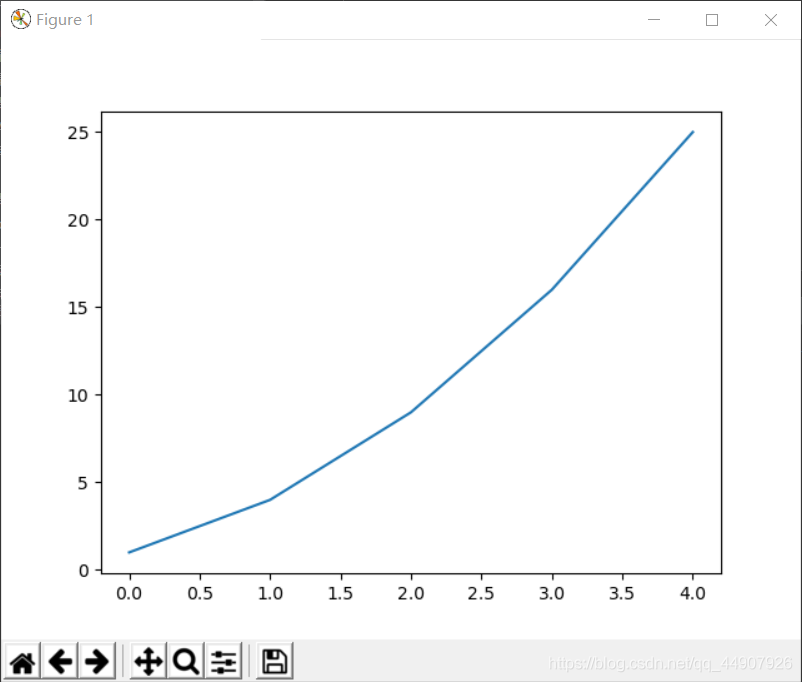
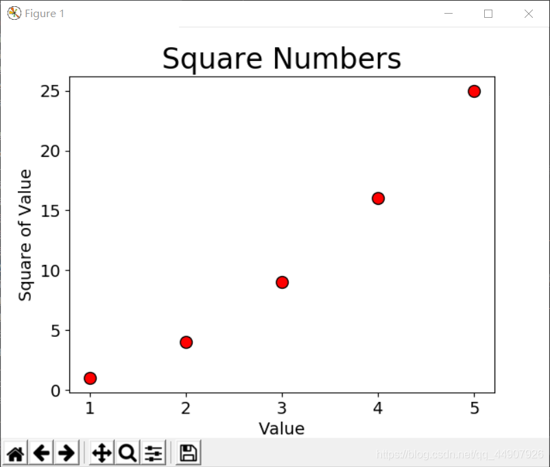
import matplotlib.pyplot as plt
x_values = [1, 2, 3, 4, 5]
y_values = [1, 4, 9, 16, 25]
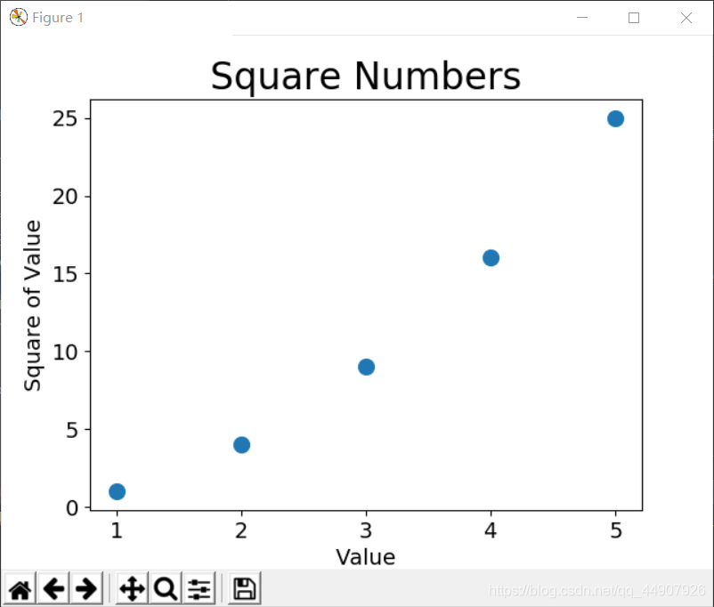
plt.scatter(x_values, y_values, c='red', edgecolors='black', s=100)
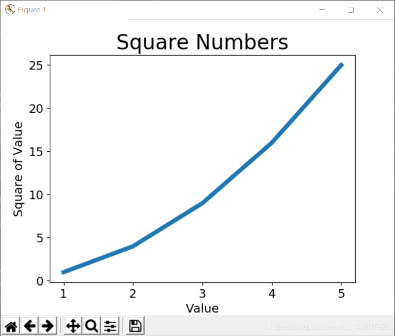
plt.title('Square Numbers', fontsize=24)
plt.xlabel('Value', fontsize=14)
plt.ylabel('Square of Value', fontsize=14)
plt.tick_params(axis='both', labelsize=14)
plt.show()
**还可以使用RGB颜色模式自定义颜色。要指定自定义颜色,可传递参数c,并将其设置为一个元组,其中包含三个0~1之间的小数值,它们分别表示红绿蓝的分量。如下是一个淡蓝色点组成的散点图:
plt.scatter(x_values, y_values, c=(0,0,0.8), edgecolors=‘black’, s=100)
值越接近0,指定的颜色越深;值越接近1,指定的颜色越浅。
**
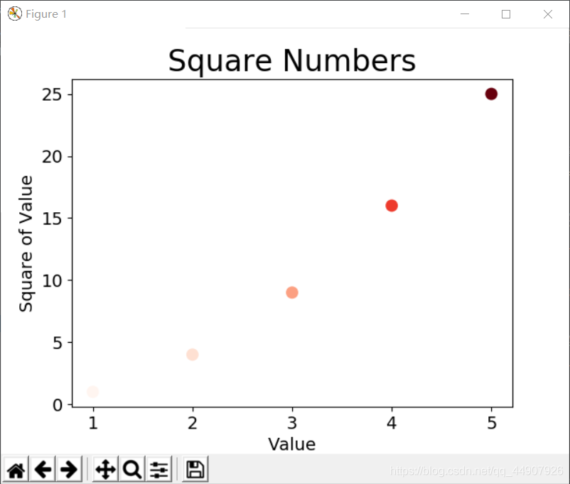
(7)使用颜色映射
颜色映射是一系列颜色,它们从开始颜色渐变到结束颜色。在可视化中,颜色映射用于突出数据的规律!
模块pyplot内置了一组颜色映射。要使用这些颜色映射,你要告诉pyplot该如何设置数据集中每个点的颜色。下面示范如何根据每个点的y值来设置其颜色:
import matplotlib.pyplot as plt
x_values = [1, 2, 3, 4, 5]
y_values = [1, 4, 9, 16, 25]
plt.scatter(x_values, y_values, c=y_values, cmap=plt.cm.Reds, edgecolors='none', s=100)
plt.title('Square Numbers', fontsize=24)
plt.xlabel('Value', fontsize=14)
plt.ylabel('Square of Value', fontsize=14)
plt.tick_params(axis='both', labelsize=14)
plt.show()

(8)自动保存图表
将对plt.show()的调用替换为对plt.savefig()的调用:
plt.savefig('squares_plot.png', bbox_inches='tight')
第一个实参指定以什么样的文件名保存;
第二个实参指定将图表多余的空白区域裁剪掉,如果要保留图表周围多余的空白区域,可省略这个实参。
cs