目录
- 前言
- 首先搭建环境
- 实例代码
- 例子1:
- 例子2:
- 例子3:
- 例子4:
- 例子5:
- 例子6:
- 总结
前言
前面写过一篇用Python制作PPT的博客,感兴趣的可以参考
用Python制作PPT
这篇是关于用Python进行数据可视化的,准备作为一个长贴,随时更新有价值的Python可视化用例,都是网上搜集来的,与君共享,本文所有测试均基于Python3.
首先搭建环境
$pip install pyecharts -U
$pip install echarts-themes-pypkg
$pip install snapshot_selenium
$pip install echarts-countries-pypkg
$pip install echarts-cities-pypkg
$pip install echarts-china-provinces-pypkg
$pip install echarts-china-cities-pypkg
$pip install echarts-china-counties-pypkg
$pip install echarts-china-misc-pypkg
$pip install echarts-united-kingdom-pypkg
$pip install -i https://pypi.tuna.tsinghua.edu.cn/simple pyecharts
$git clone https://github.com/pyecharts/pyecharts.git
$cd pyecharts/
$pip install -r requirements.txt
$python setup.py install
一顿操作下来,该装的不该装的都装上了,多装一些包没坏处,说不定哪天就用上了呢
实例代码
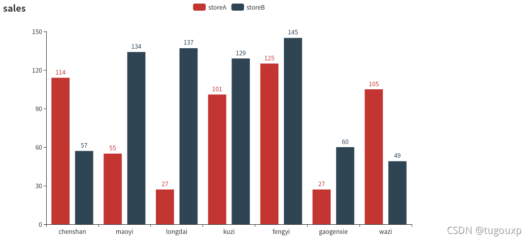
例子1:
from pyecharts.charts import Bar
from pyecharts import options as opts

bar = (
    Bar()
    .add_xaxis(["chenshan", "maoyi", "longdai", "kuzi", "fengyi", "gaogenxie", "wazi"])
    .add_yaxis("storeA", [114, 55, 27, 101, 125, 27, 105])
    .add_yaxis("storeB", [57, 134, 137, 129, 145, 60, 49])
    .set_global_opts(title_opts=opts.TitleOpts(title="sales"))
)
#bar.render_notebook()
bar.render()
render():默认将会在根目录下生成一个 render.html 的文件,支持 path 参数,设置文件保存位置,如 render("./xx/xxx.html").
结果是以网页的形式输出的,执行后,在当前目录下生成render.html,用浏览器打开,最好事先安装chrome浏览器.
例子2:
from pyecharts import options as opts
from pyecharts.charts import Pie
from pyecharts.faker import Faker

pie = (
    Pie()
    .add("", [list(z) for z in zip(Faker.choose(), Faker.values())])
    .set_colors(["blue", "green", "yellow", "red", "pink", "orange", "purple"])
    .set_global_opts(title_opts=opts.TitleOpts(title="Pie-设置颜色"))
    .set_series_opts(label_opts=opts.LabelOpts(formatter="{b}: {c}"))
)

pie.render()

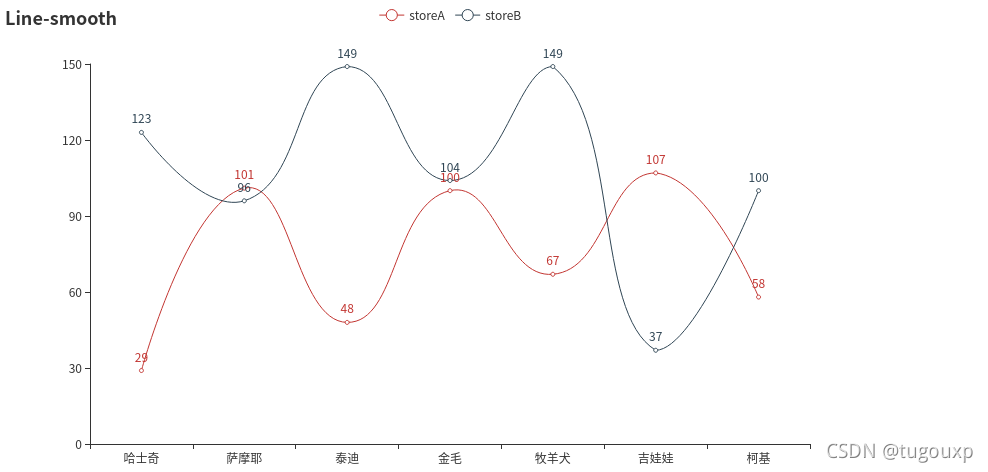
例子3:
import pyecharts.options as opts
from pyecharts.charts import Line
from pyecharts.faker import Faker

c = (
    Line()
    .add_xaxis(Faker.choose())
    .add_yaxis("storeA", Faker.values(), is_smooth=True)
    .add_yaxis("storeB", Faker.values(), is_smooth=True)
    .set_global_opts(title_opts=opts.TitleOpts(title="Line-smooth"))
)
c.render()
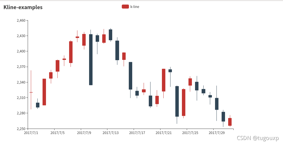
例子4:
from pyecharts import options as opts
from pyecharts.charts import Kline

data = [
    [2320.26, 2320.26, 2287.3, 2362.94],
    [2300, 2291.3, 2288.26, 2308.38],
    [2295.35, 2346.5, 2295.35, 2345.92],
    [2347.22, 2358.98, 2337.35, 2363.8],
    [2360.75, 2382.48, 2347.89, 2383.76],
    [2383.43, 2385.42, 2371.23, 2391.82],
    [2377.41, 2419.02, 2369.57, 2421.15],
    [2425.92, 2428.15, 2417.58, 2440.38],
    [2411, 2433.13, 2403.3, 2437.42],
    [2432.68, 2334.48, 2427.7, 2441.73],
    [2430.69, 2418.53, 2394.22, 2433.89],
    [2416.62, 2432.4, 2414.4, 2443.03],
    [2441.91, 2421.56, 2418.43, 2444.8],
    [2420.26, 2382.91, 2373.53, 2427.07],
    [2383.49, 2397.18, 2370.61, 2397.94],
    [2378.82, 2325.95, 2309.17, 2378.82],
    [2322.94, 2314.16, 2308.76, 2330.88],
    [2320.62, 2325.82, 2315.01, 2338.78],
    [2313.74, 2293.34, 2289.89, 2340.71],
    [2297.77, 2313.22, 2292.03, 2324.63],
    [2322.32, 2365.59, 2308.92, 2366.16],
    [2364.54, 2359.51, 2330.86, 2369.65],
    [2332.08, 2273.4, 2259.25, 2333.54],
    [2274.81, 2326.31, 2270.1, 2328.14],
    [2333.61, 2347.18, 2321.6, 2351.44],
    [2340.44, 2324.29, 2304.27, 2352.02],
    [2326.42, 2318.61, 2314.59, 2333.67],
    [2314.68, 2310.59, 2296.58, 2320.96],
    [2309.16, 2286.6, 2264.83, 2333.29],
    [2282.17, 2263.97, 2253.25, 2286.33],
    [2255.77, 2270.28, 2253.31, 2276.22],
]


k = (
    Kline()
    .add_xaxis(["2017/7/{}".format(i + 1) for i in range(31)])
    .add_yaxis("k-line", data)
    .set_global_opts(
        yaxis_opts=opts.AxisOpts(is_scale=True),
        xaxis_opts=opts.AxisOpts(is_scale=True),
        title_opts=opts.TitleOpts(title="Kline-examples"),
    )

)
k.render()
例子5:
from pyecharts import options as opts
from pyecharts.charts import Gauge

g = (
    Gauge()
    .add("", [("complete", 66.6)])
    .set_global_opts(title_opts=opts.TitleOpts(title="Gauge-basic examples"))
)

g.render()

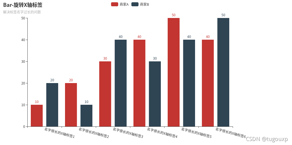
例子6:
from pyecharts import options as opts
from pyecharts.charts import Bar

(
    Bar()
    .add_xaxis(
        [
            "名字很长的X轴标签1",
            "名字很长的X轴标签2",
            "名字很长的X轴标签3",
            "名字很长的X轴标签4",
            "名字很长的X轴标签5",
            "名字很长的X轴标签6",
        ]
    )
    .add_yaxis("商家A", [10, 20, 30, 40, 50, 40])
    .add_yaxis("商家B", [20, 10, 40, 30, 40, 50])
    .set_global_opts(
        xaxis_opts=opts.AxisOpts(axislabel_opts=opts.LabelOpts(rotate=-15)),
        title_opts=opts.TitleOpts(title="Bar-旋转X轴标签", subtitle="解决标签名字过长的问题"),
    )
    .render()
)
from pyecharts import options as opts
from pyecharts.faker import Faker
from pyecharts.charts import Page, Pie
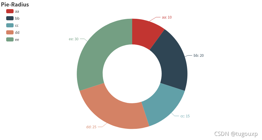
l1 = ['aa','bb','cc','dd','ee']
num =[10,20,15,25,30]
c = (
Pie()
.add(
"",
[list(z) for z in zip(l1, num)],
radius=["40%", "75%"], # 圆环的粗细和大小
)
.set_global_opts(
title_opts=opts.TitleOpts(title="Pie-Radius"),
legend_opts=opts.LegendOpts(
orient="vertical", pos_top="5%", pos_left="2%" # 左面比例尺
),
)
.set_series_opts(label_opts=opts.LabelOpts(formatter="{b}: {c}"))
)
c.render()
from pyecharts.faker import Faker
from pyecharts import options as opts
from pyecharts.charts import Page, Pie
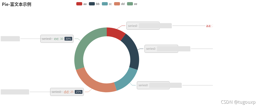
l1 = ['aa','bb','cc','dd','ee']
num =[10,20,15,25,30]
c = (
Pie()
.add(
"",
[list(z) for z in zip(l1, num)],
radius=["40%", "55%"],
label_opts=opts.LabelOpts(
position="outside",
formatter="{a|{a}}{abg|} {hr|} {b|{b}: }{c} {per|{d}%} ",
background_color="#eee",
border_color="#aaa",
border_width=1,
border_radius=4,
rich={
"a": {"color": "#999", "lineHeight": 22, "align": "center"},
"abg": {
"backgroundColor": "#e3e3e3",
"width": "100%",
"align": "right",
"height": 22,
"borderRadius": [4, 4, 0, 0],
},
"hr": {
"borderColor": "#aaa",
"width": "100%",
"borderWidth": 0.5,
"height": 0,
},
"b": {"fontSize": 16, "lineHeight": 33},
"per": {
"color": "#eee",
"backgroundColor": "#334455",
"padding": [2, 4],
"borderRadius": 2,
},
},
),
)
.set_global_opts(title_opts=opts.TitleOpts(title="Pie-富文本示例"))
)
c.render()
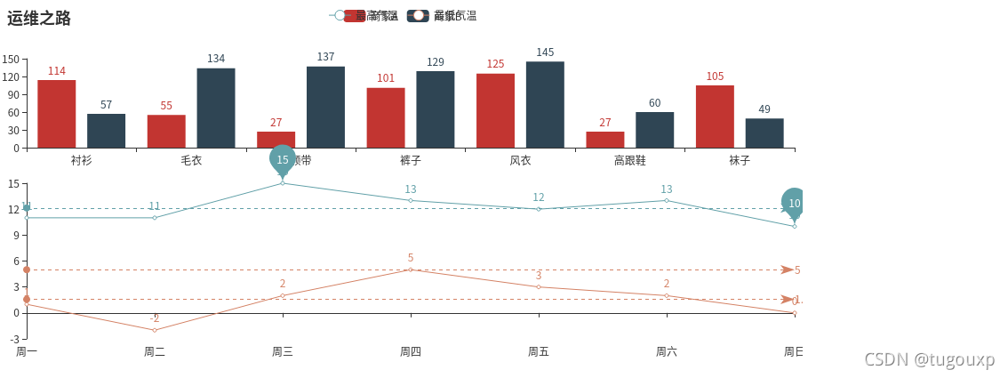
from pyecharts import options as opts
from pyecharts.charts import Line, Bar, Grid
bar = (
    Bar()
    .add_xaxis(["衬衫", "毛衣", "领带", "裤子", "风衣", "高跟鞋", "袜子"])
    .add_yaxis("商家A", [114, 55, 27, 101, 125, 27, 105])
    .add_yaxis("商家B", [57, 134, 137, 129, 145, 60, 49])
    .set_global_opts(title_opts=opts.TitleOpts(title="运维之路"),)
)
week_name_list = ["周一", "周二", "周三", "周四", "周五", "周六", "周日"]
high_temperature = [11, 11, 15, 13, 12, 13, 10]
low_temperature = [1, -2, 2, 5, 3, 2, 0]
line2 = (
    Line(init_opts=opts.InitOpts(width="1600px", height="800px"))
    .add_xaxis(xaxis_data=week_name_list)
    .add_yaxis(
        series_name="最高气温",
        y_axis=high_temperature,
        markpoint_opts=opts.MarkPointOpts(
            data=[
                opts.MarkPointItem(type_="max", name="最大值"),
                opts.MarkPointItem(type_="min", name="最小值"),
            ]
        ),
        markline_opts=opts.MarkLineOpts(
            data=[opts.MarkLineItem(type_="average", name="平均值")]
        ),
    )
    .add_yaxis(
        series_name="最低气温",
        y_axis=low_temperature,
        markpoint_opts=opts.MarkPointOpts(
            data=[opts.MarkPointItem(value=-2, name="周最低", x=1, y=-1.5)]
        ),
        markline_opts=opts.MarkLineOpts(
            data=[
                opts.MarkLineItem(type_="average", name="平均值"),
                opts.MarkLineItem(symbol="none", x="90%", y="max"),
                opts.MarkLineItem(symbol="circle", type_="max", name="最高点"),
            ]
        ),
    )
    .set_global_opts(
        #title_opts=opts.TitleOpts(title="气温变化", subtitle="纯属虚构"),
        tooltip_opts=opts.TooltipOpts(trigger="axis"),
        toolbox_opts=opts.ToolboxOpts(is_show=True),
        xaxis_opts=opts.AxisOpts(type_="category", boundary_gap=False),
        #legend_opts=opts.LegendOpts(pos_left="right"),
    )
    #.render("temperature_change_line_chart.html")
)
# 最后的 Grid
#grid_chart = Grid(init_opts=opts.InitOpts(width="1400px", height="800px"))
grid_chart = Grid()
grid_chart.add(
    bar,
    grid_opts=opts.GridOpts(
        pos_left="3%", pos_right="1%", height="20%"
    ),
)
# wr
grid_chart.add(
    line2,
    grid_opts=opts.GridOpts(
        pos_left="3%", pos_right="1%", pos_top="40%", height="35%"
    ),
)
#grid_chart.render("professional_kline_chart.html")
grid_chart.render()
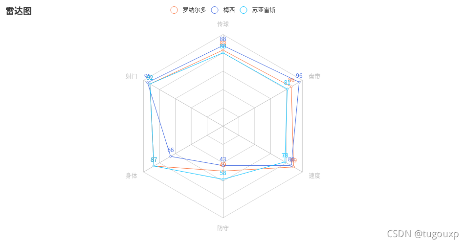
from pyecharts import options as opts
from pyecharts.charts import Radar
v1=[[83, 92, 87, 49, 89, 86]]  # 数据必须为二维数组,否则会集中一个指示器显示
v2=[[88, 95, 66, 43, 86, 96]]
v3=[[80, 92, 87, 58, 78, 81]]
radar1=(
    Radar()
    .add_schema(# 添加schema架构
        schema=[
            opts.RadarIndicatorItem(name='传球',max_=100),# 设置指示器名称和最大值
            opts.RadarIndicatorItem(name='射门',max_=100),
            opts.RadarIndicatorItem(name='身体',max_=100),
            opts.RadarIndicatorItem(name='防守',max_=100),
            opts.RadarIndicatorItem(name='速度',max_=100),
            opts.RadarIndicatorItem(name='盘带',max_=100),
        ]
    )
    .add('罗纳尔多',v1,color="#f9713c") # 添加一条数据,参数1为数据名,参数2为数据,参数3为颜色
    .add('梅西',v2,color="#4169E1")
    .add('苏亚雷斯',v3,color="#00BFFF")
    .set_global_opts(title_opts=opts.TitleOpts(title='雷达图'),)
)
radar1.render()
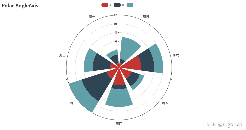
import math
import random
from pyecharts.faker import Faker
from pyecharts import options as opts
from pyecharts.charts import Page, Polar
c = (
        Polar()
        .add_schema(
            angleaxis_opts=opts.AngleAxisOpts(data=Faker.week, type_="category")
        )
        .add("A", [1, 2, 3, 4, 3, 5, 1], type_="bar", stack="stack0")
        .add("B", [2, 4, 6, 1, 2, 3, 1], type_="bar", stack="stack0")
        .add("C", [1, 2, 3, 4, 1, 2, 5], type_="bar", stack="stack0")
        .set_global_opts(title_opts=opts.TitleOpts(title="Polar-AngleAxis"))
    )
c.render()
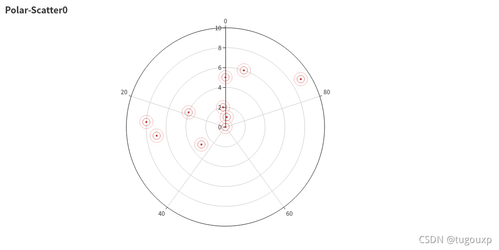
import math
import random
from pyecharts.faker import Faker
from pyecharts import options as opts
from pyecharts.charts import Page, Polar
data = [(i, random.randint(1, 100)) for i in range(10)]
c = (
        Polar()
        .add("", data, type_="effectScatter",
             effect_opts=opts.EffectOpts(scale=10, period=5),
             label_opts=opts.LabelOpts(is_show=False))
        #  type默认为"line",
        #  "effectScatter",scatter,bar
        .set_global_opts(title_opts=opts.TitleOpts(title="Polar-Scatter0"))
)
c.render()
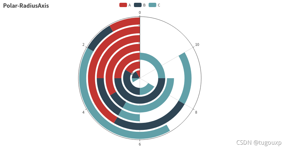
import math
import random
from pyecharts.faker import Faker
from pyecharts import options as opts
from pyecharts.charts import Page, Polar
c = (
        Polar()
        .add_schema(
            radiusaxis_opts=opts.RadiusAxisOpts(data=Faker.week, type_="category")
        )
        .add("A", [1, 2, 3, 4, 3, 5, 1], type_="bar", stack="stack0")
        .add("B", [2, 4, 6, 1, 2, 3, 1], type_="bar", stack="stack0")
        .add("C", [1, 2, 3, 4, 1, 2, 5], type_="bar", stack="stack0")
        .set_global_opts(title_opts=opts.TitleOpts(title="Polar-RadiusAxis"))
)
c.render()
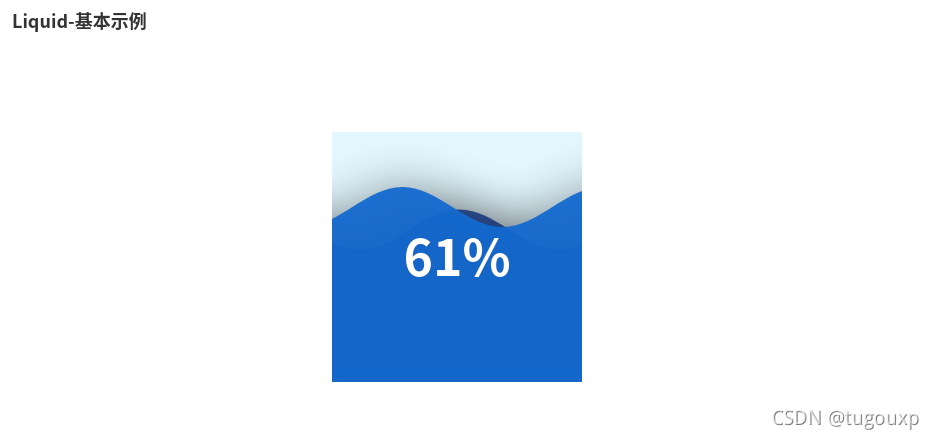
from pyecharts import options as opts
from pyecharts.charts import Liquid, Page
from pyecharts.globals import SymbolType

c = (
        Liquid()
        .add("lq", [0.61, 0.7],shape='rect',is_outline_show=False)
        # 水球外形,有' circle', 'rect', 'roundRect', 'triangle', 'diamond', 'pin', 'arrow' 可选。
        # 默认 'circle'。也可以为自定义的 SVG 路径。
        #is_outline_show设置边框
        .set_global_opts(title_opts=opts.TitleOpts(title="Liquid-基本示例"))
)
c.render()
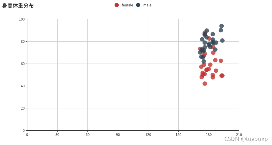
散点图:
from pyecharts.charts import Scatter
import pyecharts.options as opts

female_height = [161.2,167.5,159.5,157,155.8,170,159.1,166,176.2,160.2,172.5,170.9,172.9,153.4,160,147.2,168.2,175,157,167.6,159.5,175,166.8,176.5,170.2,]
female_weight = [51.6,59,49.2,63,53.6,59,47.6,69.8,66.8,75.2,55.2,54.2,62.5,42,50,49.8,49.2,73.2,47.8,68.8,50.6,82.5,57.2,87.8,72.8,54.5,]

male_height = [174 ,175.3 ,193.5 ,186.5 ,187.2 ,181.5 ,184 ,184.5 ,175 ,184 ,180 ,177.8 ,192 ,176 ,174 ,184 ,192.7 ,171.5 ,173 ,176 ,176 ,180.5 ,172.7 ,176 ,173.5 ,178 ,]
male_weight = [65.6 ,71.8 ,80.7 ,72.6 ,78.8 ,74.8 ,86.4 ,78.4 ,62 ,81.6 ,76.6 ,83.6 ,90 ,74.6 ,71 ,79.6 ,93.8 ,70 ,72.4 ,85.9 ,78.8 ,77.8 ,66.2 ,86.4 ,81.8 ,89.6 ,]

scatter = Scatter()
scatter.add_xaxis(female_height)
scatter.add_xaxis(male_height)
scatter.add_yaxis("female", female_weight, symbol_size=15) #散点大小
scatter.add_yaxis("male", male_weight, symbol_size=15) #散点大小
scatter.set_global_opts(title_opts=opts.TitleOpts(title="身高体重分布"),
                        xaxis_opts=opts.AxisOpts(
                            type_ = "value", # 设置x轴为数值轴
                            splitline_opts=opts.SplitLineOpts(is_show = True)), # x轴分割线
                        yaxis_opts=opts.AxisOpts(splitline_opts=opts.SplitLineOpts(is_show=True))# y轴分割线
                        )
scatter.set_series_opts(label_opts=opts.LabelOpts(is_show=False))
scatter.render("./html/scatter_base.html")
总结
jsjbwy