10.21-10.25之 WEB任务(一)
1、一周复习hcj,HTML一般用的也就那些东西,了解一下行内元素、块级元素、行内块元素。
2、清除浮动(好像是五种还是六种方式)
3、BFC(概念、触发、作用、应用)
4、居中问题(水平垂直居中方法,大概有十来种,你自己总结一下)
5、圣杯布局(flex、float、position要会,尤其前两种,gird和table了解就行)
6、轮播图:js原生做弄清楚原理有箭头,实现了写导航点自动播放然后无缝
注:就是不是让你全背下来,但是常用的要会,不能写什么都要翻文档,菜鸟或者w3c都可以 。
上一篇:BFC的概念、触发、作用及应用
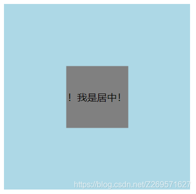
四、居中问题的方法总结
元素水平居中
- 方法一:最简单的当然就是
margin: 0 auto
HTML:
<body>
		<div class="father">
			<div class="son">!我是居中!</div>
		</div>
	</body>
CSS:
.father{
				width: 18.75rem;
				height: 18.75rem;
				background-color: lightblue;
				/* margin: 0 auto; */
			}

			.son{
				width: 6.25rem;
				height: 6.25rem;
				background-color: gray;
				text-align: center;//文字水平居中
				line-height: 6.25rem;//文字行高和height相同文字垂直居中
				margin: 0 auto;
			}
图示:

- 方法二:
display: inline-block;
HTML:不变
CSS:
<style>
			.father{
				width: 18.75rem;
				height: 18.75rem;
				background-color: lightblue;
				text-align: center;//行内元素son水平居中
			}

			.son{
				width: 6.25rem;
				height: 6.25rem;
				background-color: gray;
				line-height: 6.25rem;
				display: inline-block;//因为inline改变不了宽高,block块级元素操作不了居中,inline-block刚刚好
			}
		</style>
效果图和上图一样
元素水平垂直居中
- 方法一:位置
父:position:relative
子:position:absolute left:50% top:50%
然后子元素在margin中对应的left和top减去自身的宽度或用transform: translate(-50%,-50%);
废话不多说,上CSS代码:
			.father{
				width: 18.75rem;
				height: 18.75rem;
				background-color: lightblue;
				position: relative;
			}

			.son{
				width: 6.25rem;//等同于100px,HBuilder自动换算的
				height: 6.25rem;
				background-color: gray;
				line-height: 6.25rem;
				text-align: center;
				position: absolute;
				left: 50%;
				top: 50%;
				margin: -50px 0 0 -50px;//这里的-50px就是自身宽度*百分比计算出的。
				/* transform: translate(-50%,-50%);   margin和transform方法任选其一,效果相同*/
			}
- 方法二:flex布局
要点:都在father身上做改变
html不变,css如下:
			.father{
				width: 18.75rem;
				height: 18.75rem;
				background-color: lightblue;
				display: flex;
				justify-content: center;//使子元素水平居中
				align-items: center;//使子元素垂直居中
			}

			.son{
				width: 6.25rem;
				height: 6.25rem;
				background-color: gray;
				line-height: 6.25rem;
				text-align: center;
			}
- 方法三:table-cell布局
table-cell相当于表格的td,td为行内元素,无法设置宽和高,所以要嵌套一层在html中,并设置dispiay:inline-block
HTML:
<div class="father">
			<div class="son">
				<div class="grandson">居中啦!</div>
			</div>
		</div>
CSS:
			.father{
				width: 18.75rem;
				height: 18.75rem;
				background-color: lightblue;
				display: table;
			}
			.son{
				background-color: pink;
				display: table-cell;
				vertical-align: middle;//垂直布局
				text-align: center;//水平布局
			}

			.grandson{
				width: 6.25rem;
				height: 6.25rem;
				background-color: gray;
				display: inline-block;
				text-align: center;
				line-height: 100px;
			}
下一篇:圣杯布局、双飞翼布局
cs