充电摇晃效果
大体上采用伪元素来实现的电池充电效果
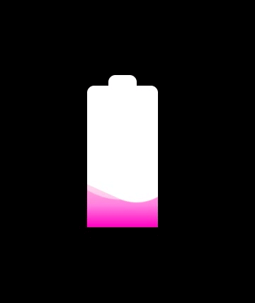
实现效果
实现思路
- 首先搭建一个html框架,建出电池模型
- 先尝试利用动画实现水面上升的效果
- 利用伪元素不规则的圆,定位在水的上半部分,让这个不规则的圆,来遮盖水,从而使水面出现不均,再让不规则的圆旋转,使得,遮盖水面的情况不一样,形成涟漪的效果
- 再利用伪元素,同样的方法建一个不规则圆,给点透明度,出现背后的阴影效果
要点分析
创建明显的水纹
.wave::before {
    position: absolute;
    content: '';
    top: -185px;
    left: -50px;//通过调试定位到合适的位置
    width: 200px;
    height: 200px;
    border-radius: 30%;// 不规则圆弧
    background-color: white;//背景色改成白色这样可以盖住水纹确不被察觉
    animation: move 10s linear infinite;//添加动画
}
创建水纹的重影
//在上面的基础上添加一定的透明度
opacity: .5;
完整代码
<!DOCTYPE html>
<html lang="en">
<head>
    <meta charset="UTF-8">
    <meta http-equiv="X-UA-Compatible" content="IE=edge">
    <meta name="viewport" content="width=device-width, initial-scale=1.0">
    <title>Document</title>
    <style>
        * {
            margin: 0;
            padding: 0;
        }
        body {
            background-color: black;
        }
        .charge {
            position: relative;
            width: 100px;
            height: 200px;
            margin: 200px auto;
            background-color: white;
            border-top-left-radius: 10px;
            border-top-right-radius: 10px;
            text-shadow: 0px 0px 10px white;
        }
        .charge::after {
            content: '';
            position: absolute;
            top: -15px;
            left: 30px;
            width: 40px;
            height: 15px;
            border-top-left-radius: 10px;
            border-top-right-radius: 10px;
            background-color: white;
        }
        .wave {
            position: absolute;
            bottom: 0;
            width: 100%;
            background: linear-gradient( #ffb3d9, #ff80df,#ff00bf);
            overflow: hidden;
            animation: more 10s linear infinite;
        }
        @keyframes more {
            0% {
                height: 0%;
            }
            100% {
                height: 100%;
            }
        }
        .wave::before {
            position: absolute;
            content: '';
            top: -185px;
            left: -50px;
            width: 200px;
            height: 200px;
            border-radius: 45%;
            background-color: white;
            animation: move 10s linear infinite;
        }
        .wave::after {
            position: absolute;
            content: '';
            top: -180px;
            left: -50px;
            width: 200px;
            height: 200px;
            border-radius: 45%;
            background-color: white;
            opacity: .5;
            animation: move 8s linear infinite;
        }
        @keyframes move {
            100% {
                transform: rotate(360deg);
            }
        }
    </style>
</head>
<body>
    <div class="charge">
        <div class="wave"></div>
    </div>
</body>
</html>
昨晚去参加了学校工作室的面试,发现自己还有很多的不足,有很多的知识点疏漏,希望面前的你,能够再细致一点,再努力一点,加油吧!
推荐阅读
旋转水滴加载效果
抖音超火的罗盘时钟效果
圆盘时钟效果
文字抖动效果
旋转魔方效果
文字闪烁效果
加载动画效果
炫彩流光按钮
原生js轮播图效果
文字折叠效果
cs