爱心跳动效果 CSS实现
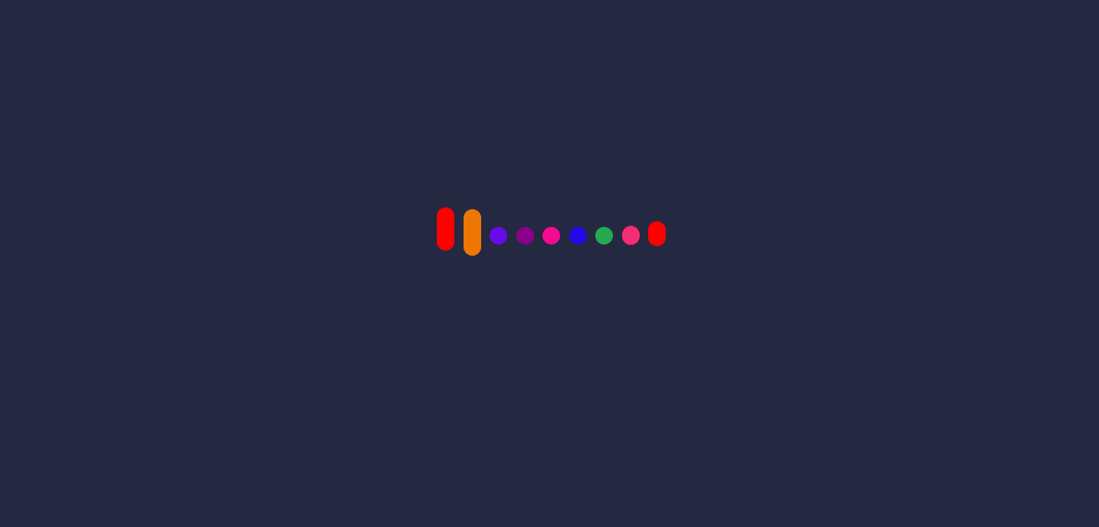
实现效果
砰砰砰
实现原理
通过动画改变每个元素的高度,从而实现每个元素高度变化的效果,为了使每个元素依次跳动,给每个元素添加一定的延时效果,使得从效果元素依次跳动
代码分析
核心动画
一共写了5个动画,但是实现的东西都是差不多的,只是改变的高度不同,这是其中的一个动画
改变元素的高度,并且上移一段距离,这个距离就是画爱心的关键,如果没有这个移动距离,元素始终保持着下端对齐,不会摆出爱心的效果,所以这个可以根据自己的实际高度来调定。
@keyframes jump1 {
    30%,50% {
        height: 60px;
        transform: translateY(-30px);
    }
    70%,100% {
        height: 20px;
        transform: translateY(0px);
    }
}
完整代码
<!DOCTYPE html>
<html lang="en">

<head>
    <meta charset="UTF-8">
    <meta http-equiv="X-UA-Compatible" content="IE=edge">
    <meta name="viewport" content="width=device-width, initial-scale=1.0">
    <title>爱心跳动效果</title>
    <style>
        * {
            margin: 0;
            padding: 0;
        }

        .loveBox {
            display: flex;
            justify-content: center;
            align-items: center;
            height: 100vh;
            background-color: rgb(36, 40, 66);
        }

        .loveLine {
            height: 200px;
        }

        .loveLine li {
            float: left;
            list-style: none;
            width: 20px;
            height: 20px;
            border-radius: 10px;
            margin-right: 10px;
        }

        .loveLine li:nth-child(1) {
            background-color: red;
            animation: jump1 3s infinite;
        }

        .loveLine li:nth-child(2) {
            background-color: rgb(238, 118, 5);
            animation: jump2 3s 0.2s infinite;
        }

        .loveLine li:nth-child(3) {
            background-color: rgb(106, 10, 233);
            animation: jump3 3s 0.4s infinite;
        }

        .loveLine li:nth-child(4) {
            background-color: darkmagenta;
            animation: jump4 3s 0.6s infinite;
        }

        .loveLine li:nth-child(5) {
            background-color: rgb(245, 11, 147);
            animation: jump5 3s 0.8s infinite;
        }

        .loveLine li:nth-child(6) {
            background-color: rgb(32, 9, 231);
            animation: jump4 3s 1.0s infinite;
        }

        .loveLine li:nth-child(7) {
            background-color: rgb(36, 170, 81);
            animation: jump3 3s 1.2s infinite;
        }

        .loveLine li:nth-child(8) {
            background-color: #f62e74;
            animation: jump2 3s 1.4s infinite;
        }

        .loveLine li:nth-child(9) {
            background-color: red;
            animation: jump1 3s 1.6s infinite;
        }

        @keyframes jump1 {

            30%,
            50% {
                height: 60px;
                transform: translateY(-30px);
            }

            70%,
            100% {
                height: 20px;
                transform: translateY(0px);
            }
        }

        @keyframes jump2 {

            30%,
            50% {
                height: 120px;
                transform: translateY(-60px);
            }

            70%,
            100% {
                height: 20px;
                transform: translateY(0px);
            }
        }

        @keyframes jump3 {

            30%,
            50% {
                height: 160px;
                transform: translateY(-75px);
            }

            70%,
            100% {
                height: 20px;
                transform: translateY(0px);
            }
        }

        @keyframes jump4 {

            30%,
            50% {
                height: 180px;
                transform: translateY(-60px);
            }

            70%,
            100% {
                height: 20px;
                transform: translateY(0px);
            }
        }

        @keyframes jump5 {

            30%,
            50% {
                height: 200px;
                transform: translateY(-45px);
            }

            70%,
            100% {
                height: 20px;
                transform: translateY(0px);
            }
        }
    </style>
</head>

<body>
    <div class="loveBox">
        <ul class="loveLine">
            <li></li>
            <li></li>
            <li></li>
            <li></li>
            <li></li>
            <li></li>
            <li></li>
            <li></li>
            <li></li>
        </ul>
    </div>
</body>

</html>
感觉最近的文章内容都是很简单的东西,之后挑战一些有难度的东西吧!
更多阅读
3d悬停分层效果
充电水波摇晃效果
旋转水滴加载效果
抖音超火的罗盘时钟效果
圆盘时钟效果
文字抖动效果
旋转魔方效果
文字闪烁效果
加载动画效果
炫彩流光按钮
原生js轮播图效果
文字折叠效果
cs