实现效果

需求/功能:
怎么用CSS+HTMl绘画出一个爱心.
分析:
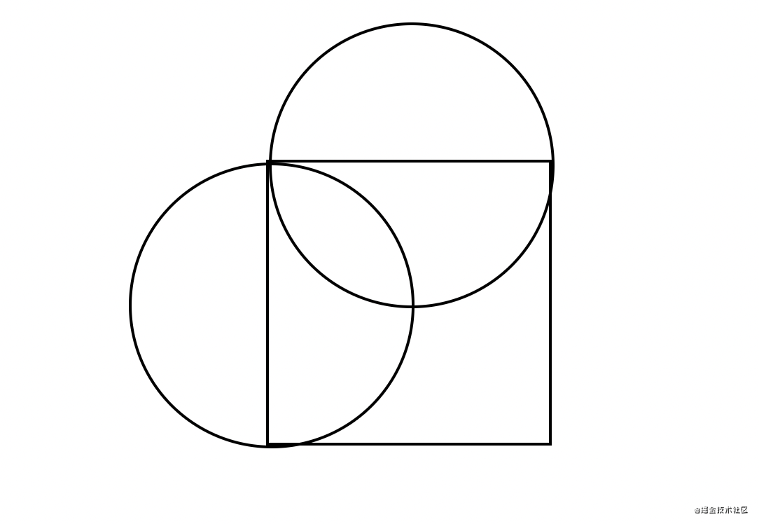
爱心可以通过一个正方形+两个圆形组合成.
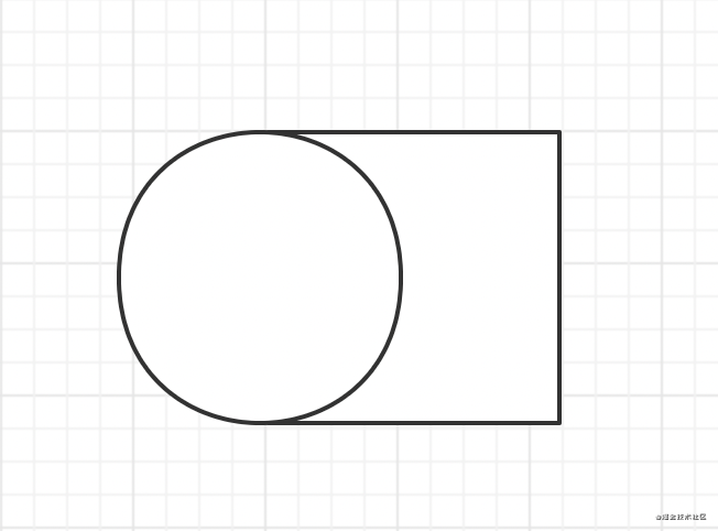
先画一个正方形+圆形, 摆放位置如下:
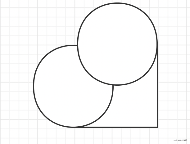
再添加上一个圆形.
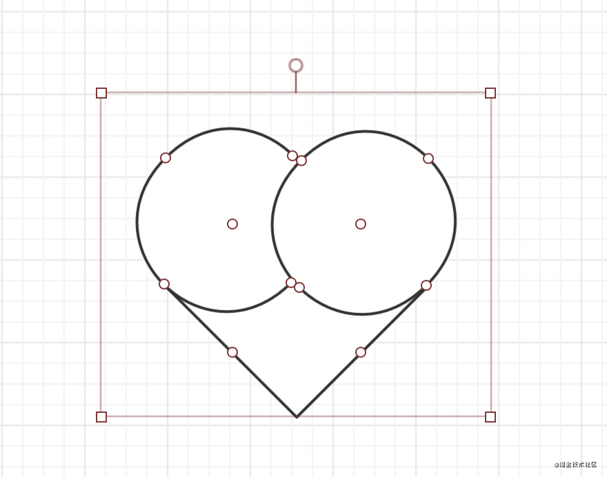
最后再将整个图形顺时针旋转45度即可.
初步实现:
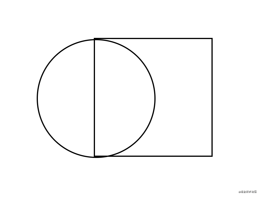
先画一个正方形:
<body>
    <div id="heart"></div>
</body>
#heart{
       height: 300px;
       width: 300px;
       border: 2px solid black;
    }
给这个正方形的左边加行一个圆形.这里使用伪类:before来实现
     #heart{
            height: 200px;
            width: 200px;
            border: 2px solid black;
            position: relative;
        }
    #heart:before{
        content: '';
        width: 200px;
        height: 200px;
        border: 2px solid black;
        border-radius: 50%; // 正方形加圆角变成圆
        position: absolute;
        left: -100px;  // 向左位移正方形一半的长度
    }
此时图形长这样:
再添加一个圆形, 这里使用after伪类来实现.
    #heart{
            height: 200px;
            width: 200px;
            border: 2px solid black;
            position: relative;
        }
        // 这里偷个懒.直接写一块了
    #heart:before,#heart:after{
        content: '';
        width: 200px;
        height: 200px;
        border: 2px solid black;
        border-radius: 50%;
        position: absolute;
        left: -100px;
    }
    // 第二个圆, 只需要向上位移正方形一半的高度
    #heart:after{
        left: 0;
        top: -100px;
    }
最后一步, 旋转一下, 然后上个颜色.去掉之前为了看清楚加的边框.
   /*给heart进行旋转并加上颜色*/
  transform: rotate(45deg);
  background-color: red;
完整代码:
<style>
        body,html{
            display: flex;
            align-items: center;
            justify-content: center;
            height: 100vh;
        }
        #heart{
            height: 200px;
            width: 200px;
            /*border: 2px solid black;*/
            position: relative;
            transform: rotate(45deg);
            background-color: red;
        }
        #heart:before,#heart:after{
            content: '';
            width: 200px;
            height: 200px;
            /*border: 2px solid black;*/
            border-radius: 50%;
            position: absolute;
            left: -100px;
            background-color: red;
        }
        #heart:after{
            left: 0;
            top: -100px;
        }
    </style>
</head>
<body>
    <div id="heart"></div>
</body>
总结:
爱心可以由一个正方形和两个圆形组成, 这里使用before和after伪类, 然后, 分别对两个伪类进行位移. 最后挤上颜色, 就可以实现一个爱心❤️.
js